Does FAANG care about degrees?
A few weeks ago I decided to play around with the survey results of stack overflow. I pickup the 2019 dataset since it was last one before the pandemic. The datast can be found here. Things in the tech sector has been a bit crazy since then, and I would like to avoid those effects. A comparison of those sets would nevertheless be interesting in their own right. Anyway lets have a load up the data and have a look
import numpy as np
import pandas as pd
import matplotlib.pyplot as plt
import matplotlib.dates as mdates
df = pd.read_csv('/home/anirban/pandas_demo/data/survey_results_public.csv')
df_ques = pd.read_csv('/home/anirban/pandas_demo/data/survey_results_schema.csv')
There are lot of columns. To see what questions correspond to these answers we can use pandas “.head” function
df_ques.headLets look at a histogram of when people wrote their first code. Before plotting we need to set a couple of string values to nans since they cannot be plotted. Also we neeed to convert it to numeric type
df.loc[df['Age1stCode'] == 'Younger than 5 years','Age1stCode'] = np.nan
df.loc[df['Age1stCode'] == 'Older than 85','Age1stCode'] = np.nan
temp_age1stcode = df['Age1stCode'].astype(float)
ax = temp_age1stcode.plot.hist(column=['Age1stCode'],  histtype='step', bins=20, label = 'Age 1st Code')
ax.set_xlabel('Age 1st Code')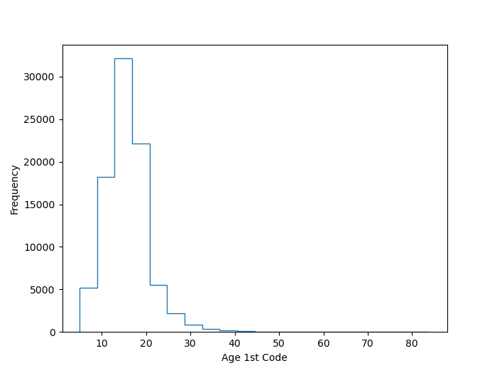
Interesting. Looks like most people wrote their first code at around 15 yrs of age. This is approximately true for me as well. Let’s also look how long people have been coding for professionally.
#years of professional coded
df.loc[df['YearsCodePro'] == 'Less than 1 year','YearsCodePro'] = np.nan
df.loc[df['YearsCodePro'] == 'More than 50 years','YearsCodePro'] = np.nan
temp_yrscodepro = df['YearsCodePro'].astype(float)
ax = temp_yrscodepro.plot.hist(column=['YearsCodePro'],  histtype='step', bins=20, label = 'Yrs coding professionally')
ax.set_xlabel('Yrs coding professionally')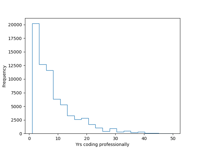
Most of the respondents seem have been coding professionally for less than 10 yrs. So probably a relatively young group of people responded to the survey I assume. Interesting. Now lets look at social media and age. Also lets try a different kind of plot, violin plot.
#Process social media
df.loc[df['SocialMedia'] == "I don't use social media",'SocialMedia'] = 'NoUse'
list_uniques = df['SocialMedia'].unique()
code = np.arange(0, len(list_uniques))
dictionary_socialmedia = dict(zip(list_uniques, code))
temp_socialmedia = df['SocialMedia'].map(dictionary_socialmedia)

temp_age= df['Age'].astype(float)
list_uniques = df['SocialMedia'].unique()
violin_data=[]
for j in np.arange(0, len(list_uniques)):
    loc = np.where((temp_socialmedia == j) & ~np.isnan(temp_age))[0]
    violin_data.append(temp_age[loc])
plt.violinplot(violin_data)
plt.xticks(code+1, list_uniques)
plt.ylabel('Age')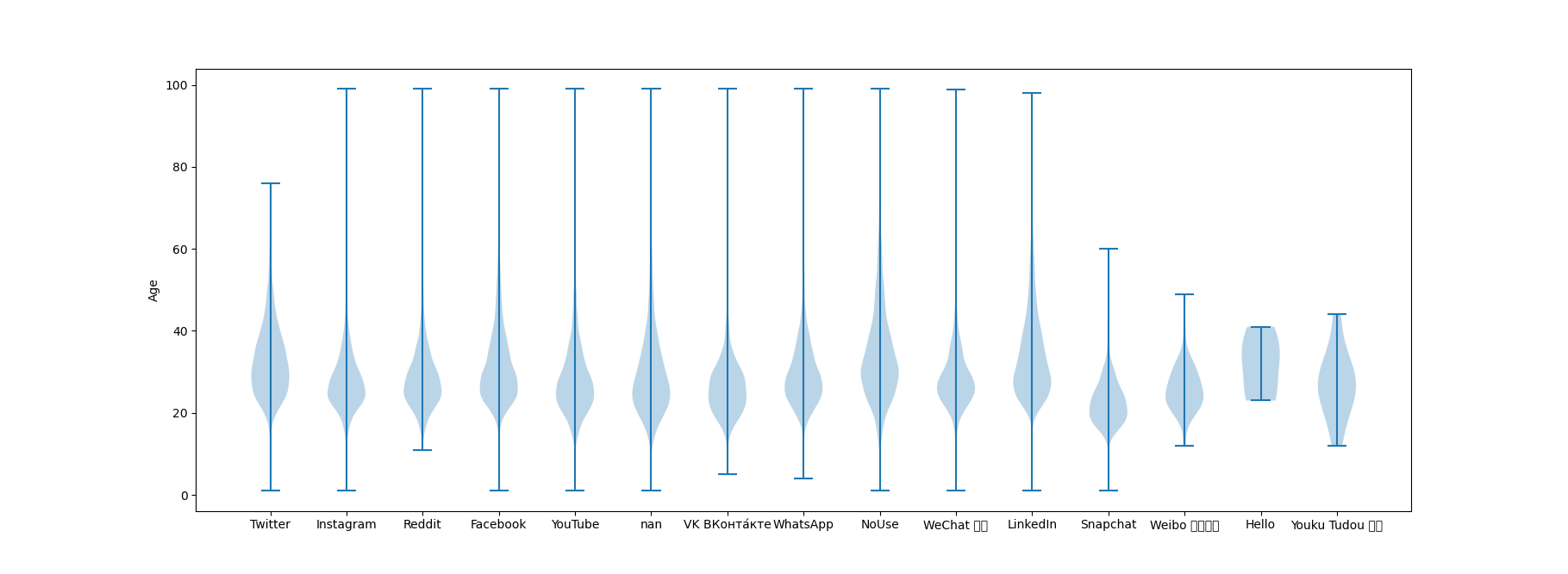
Looks like Twitter, LinkedIn and Not Using Social Media have a fatter tail i.e greater percentage of older people. Thats not super surprising. Lets look at dependents. There are only 2 unique values. Lets encode them as 1’s for having dependent and 0 for no dependent.
#Process dependents
dictionary_depend = {'No':0, 'Yes':1}
temp_depend = df['Dependents'].map(dictionary_depend)
loc1 = np.where(temp_depend == 1)[0]
loc0 = np.where(temp_depend == 0)[0]
plt.hist(temp_yrscodepro.iloc[loc1], bins= 25, histtype='step', density=True, label = 'With dependents')
plt.hist(temp_yrscodepro.iloc[loc0], bins= 25, histtype='step', density=True, label = 'No dependents')
plt.ylabel('Frequency')
plt.legend()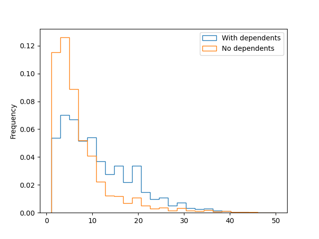
Clearly people with dependents have been coding professionally for longer. No surprises there. Lets now look at the degrees people have compared to age. we will create two bins, one younger for people age 30 and under. All people above 30 will be called older. I select 30 because by this age most people have achieved Masters of PhD if they were planning to do so. Or at least so I think.
#Process education level
list_uniques = df['EdLevel'].unique()
code_edlevel = np.arange(0, len(list_uniques))
dictionary_edlevel = dict(zip(list_uniques, code_edlevel))
temp_edlevel = df['EdLevel'].map(dictionary_edlevel)

#Process organization size
list_uniques = df['OrgSize'].unique()
code_orgsize = np.arange(0, len(list_uniques))
dictionary_orgsize = dict(zip(list_uniques, code_orgsize))
temp_orgsize = df['OrgSize'].map(dictionary_orgsize)

loc0 = np.where(temp_age <= 30)[0]
loc1 = np.where(temp_age > 30)[0]
plt.hist(temp_edlevel.iloc[loc0], bins= 9, histtype='step', density=True, label = 'Younger')
plt.hist(temp_edlevel.iloc[loc1], bins= 9, histtype='step', density=True, label = 'Older')
plt.ylabel('Frequency')
plt.legend()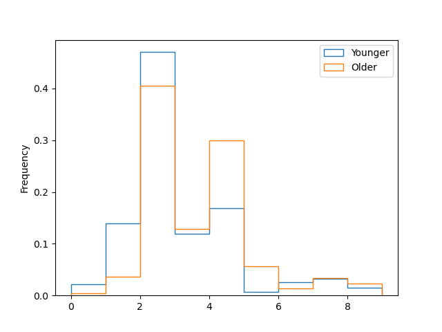
Its hard to understand what the x axis means. The best thing to do would be to rename things and re-plot. For exploratory purposes we can just look at the variable “dictionary_edlevel”. The highest bar is for bachelors degree(bar at 2.5), second highest is the masters degree(bar at 4.5). The bar to the right of Masters is PhD(bar at 5.5). Fraction of people with PhD under 30 is surprisingly low. For Masters its about 50-50. Now finally the question you have been waiting for. Does these massive FAANG companies care about Degrees. Lets look at the organization size unique values
dictionary_orgsizeWe look at 3 different classes.
loc0 = np.where(temp_orgsize == 2)[0]
loc1 = np.where(temp_orgsize == 4)[0]
loc2 = np.where(temp_orgsize == 1)[0]
plt.hist(temp_edlevel.iloc[loc0], bins= np.arange(-0.5, 10.5, 1), histtype='step', density=True, label = '10k employees')
plt.hist(temp_edlevel.iloc[loc2], bins= np.arange(-0.5, 10.5, 1), histtype='step', density=True, label = '500 employees')
plt.hist(temp_edlevel.iloc[loc1], bins= np.arange(-0.5, 10.5, 1), histtype='step', density=True, label = '20 employees')
plt.ylabel('Frequency')
plt.legend()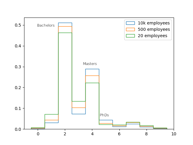
Clearly as the organization size increases, the prefence towards a formal degree inncreases. Look at the bars at 2 (for bachelors), 4 (for masters) and 5 (for PhD’s). Do not let anyone tell you otherwise.