Understanding Grade Scaling at Purdue
Scaling/Normalizing grades has never been a very clear me. So this winter, I decided to take a look at the data from the courses I have been a TA for. Some people have the notion that the final grade distribution is roughly a Normal distribution, hence the name normalization or scaling and I was certainly one of them. At this point I should point out at Purdue, scaling and normalization are used interchangeably, but they are slightly different. Simplest way to explain this is to say normalization can change the shape of the curve but scaling merely changes the scales. So, when professors say scaling I believe they mean normalizing. However, I have found these two terms used so inter-changeably that it is best to decide the meaning depending on the context.
Visualizing the Data
Let’s look at the final grades for a course. I will use panadas for data processing and matplotlib for visualization.
import pandas as pd
import matplotlib.pyplot as plt
df = pd.read_csv('/home/anirban/Projects/gradebook/course1_fall.csv')
grades=df['COURSE TOT [Total Pts: up to 2,000 Score] |4336090'].str.replace(',', '').astype(float)
#Scale grades
grades=grades/2000.0
#Make a histogram
n, bins, patches = plt.hist(grades ,bins=100, facecolor='blue', alpha=0.75)
plt.xlabel('% Marks')
plt.ylabel('# of students')
plt.show()
These scores are already curved. This is what the histogram looks like.
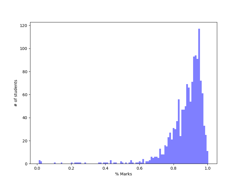 Hmm… that does not look like a Gaussian at all. Maybe, because the scores are already normalized, we get such a skewed distribution. Let’s then look at the raw totals from labs, recitation and exams.
labAvg = df['LAB-Avg [Total Pts: up to 20 Percentage] |4332915'].astype(float)/100.0
recAvg = df['REC-Avg [Total Pts: up to 25 Percentage] |4332917'].astype(float)/100.0
lecAvg = df['LEC-Avg [Total Pts: up to 4 Percentage] |4332923'].astype(float)/100.0
hwAvg = df['HW - Total [Total Pts: up to 300 Score] |4050147'].astype(float)/300.0
quizAvg = df['QUIZ - Total [Total Pts: up to 300 Score] |4050148'].astype(float)/300.0
examAvg = df['ALL EX: Max Total [Total Pts: up to 800 Score] |4328053'].astype(float)/800.0
#Scale the total
total = (labAvg+recAvg+lecAvg+hwAvg+quizAvg+examAvg)/6.0
n, bins, patches = plt.hist(total ,bins=100, facecolor='blue', alpha=0.75)
plt.xlabel('% Marks')
plt.ylabel('# of students')
plt.show()
We get
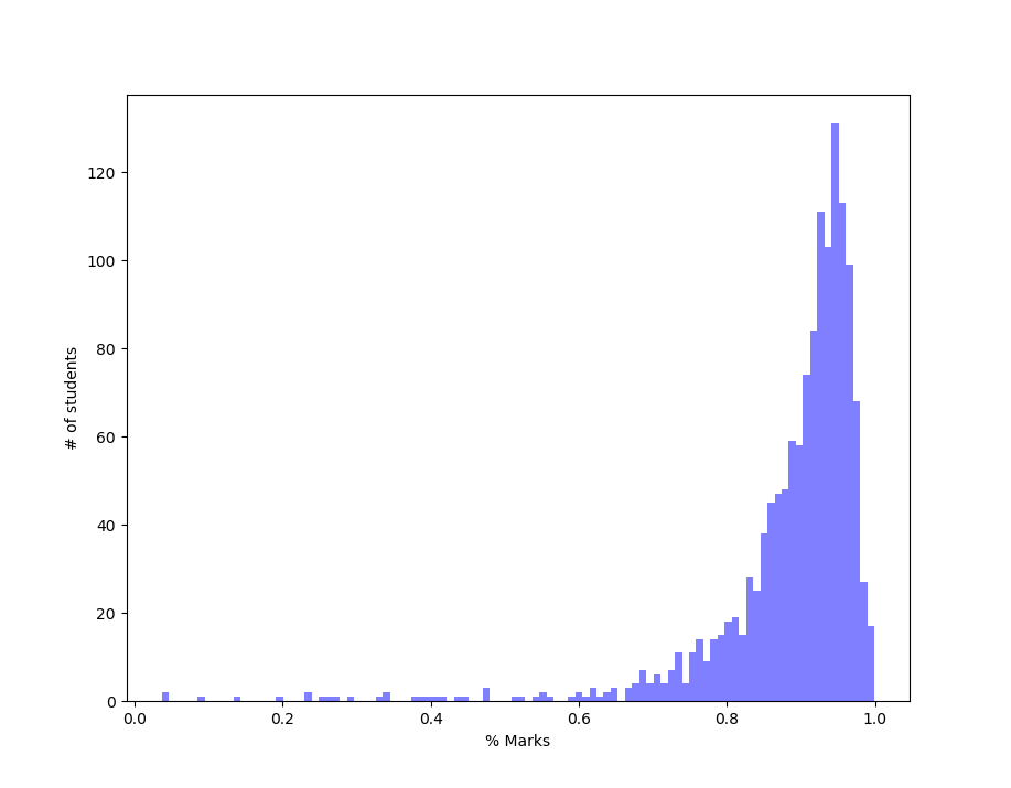 That looks even more skewed.
However, this distribution should not come as a surprise. The labs and recitations gave almost full points to everyone just for showing up to class. Hence virtually everyone got 100% for those and maybe those two distributions are enough to skew the total grade distribution. So, my guess is that HWs and Exams should show a more Normal distribution. The plots we get are
That looks even more skewed.
However, this distribution should not come as a surprise. The labs and recitations gave almost full points to everyone just for showing up to class. Hence virtually everyone got 100% for those and maybe those two distributions are enough to skew the total grade distribution. So, my guess is that HWs and Exams should show a more Normal distribution. The plots we get are
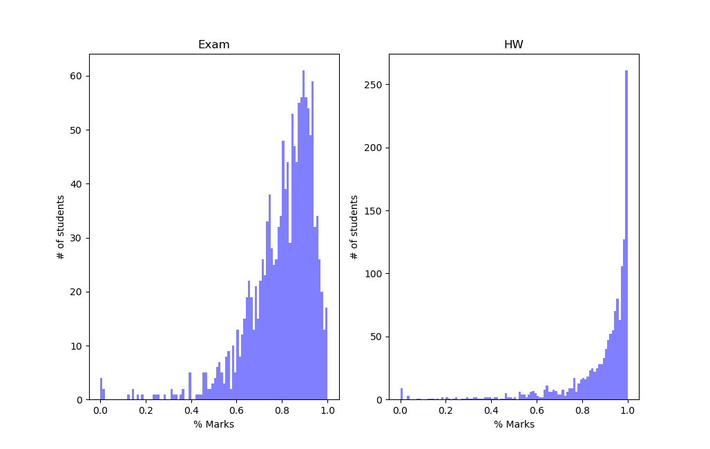 The exam distribution is kind of better. The HW curve looks almost like a flipped Poisson Distribution. If you don’t know about Poisson Distribution I would highly encourage you to read about it. I like to think of the flipped Poisson curve this way. Say we had a God who was handing out free answers. Everyone would want that. But sometimes other things can come in the way. Let’s say the probability that a student gets answer for a particular HW problem wrong is about 2% or 0.02. So on average the students gets 98% problems correct. Only a few gets a significant number of problems wrong.
While this is somewhat good approximation, the original distribution has a much longer tail. Also, the details will depend on the scale of x-axis we use. So our model is not as good. At this point however I was curious to see if these skewed distributions are just peculiar to this course or a general characteristic. Fortunately, I have dataset for another course.
df = pd.read_csv('/home/anirban/Projects/gradebook/course2_fall.csv')
a = df['Weighted Total [Total Pts: up to 179.7 Percentage] |4388776']/100.0
labAvg = df['Total Lab [Total Pts: up to 130 Score] |4712224'].astype(float)/130.0
recAvg = df['Total Rec [Total Pts: up to 130 Score] |4712221'].astype(float)/130.0
lecAvg = df['Total Lec [Total Pts: up to 52 Score] |4712222'].astype(float)/52.0
hwAvg = df['Total HW [Total Pts: up to 254 Score] |4712216'].astype(float)/254.0
examAvg = df['Total Evening Exams [Total Pts: up to 200 Score] |4712229'].astype(float)/200.0
#Scale the total
total = (labAvg+recAvg+lecAvg+hwAvg+quizAvg+examAvg)/5.0
plt.subplot(221)
n, bins, patches = plt.hist(a ,bins=100, facecolor='blue', alpha=0.5)
plt.xlabel('% Marks')
plt.ylabel('# of students')
plt.title('Normalized Total Score')
plt.subplot(222)
n, bins, patches = plt.hist(total ,bins=100, facecolor='blue', alpha=0.5)
plt.xlabel('% Marks')
plt.ylabel('# of students')
plt.title('Raw Total Score')
plt.subplot(223)
n, bins, patches = plt.hist(hwAvg ,bins=100, facecolor='blue', alpha=0.5)
plt.xlabel('% Marks')
plt.ylabel('# of students')
plt.title('HW Total Score')
plt.subplot(224)
n, bins, patches = plt.hist(examAvg ,bins=100, facecolor='blue', alpha=0.5)
plt.xlabel('% Marks')
plt.ylabel('# of students')
plt.title('Exam Total Score')
and here are the plots
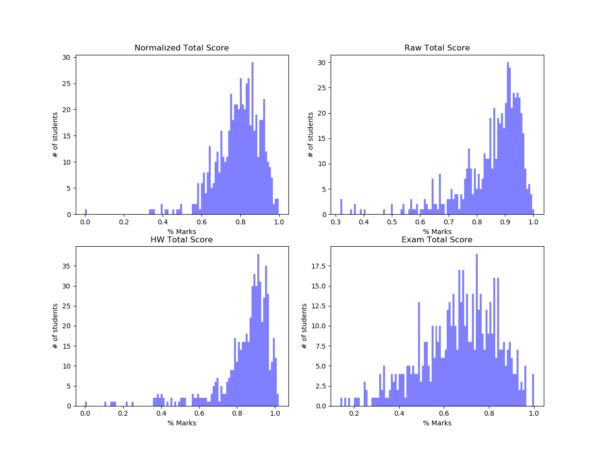
The spikes in the curves are due to binning and can be taken care of by larger bin size. Plots for this course less skewed probably because this is a higher-level course and is more difficult. The exam plots show some sort of normal distribution. Let’s take a closer look. There were two exams and each exam had a subjective part and a multiple choice part. Plotting the two separately shows the starkest contrast.
subjective = df['Exam 1 HG [Total Pts: 30 Score] |4531308'].astype(float) + df['Exam 2 HG [Total Pts: 30 Score] |4681344'].astype(float)
multipleChoice = df['Exam 1 MC [Total Pts: 70 Score] |4531196'].astype(float) + df['Exam 2 MC [Total Pts: 70 Score] |4681340'].astype(float)
subjective = subjective/60.0
multipleChoice = multipleChoice/140.0
n, bins, patches = plt.hist(subjective ,bins=50, facecolor='blue', alpha=0.25, label='Subjective')
n, bins, patches = plt.hist(multipleChoice ,bins=50, facecolor='red', alpha=0.25, label='Multiple Choice')
plt.xlabel('% Marks')
plt.ylabel('# of students')
plt.legend()
plt.title('Subjective vs Multiple Choice Score')
plt.show()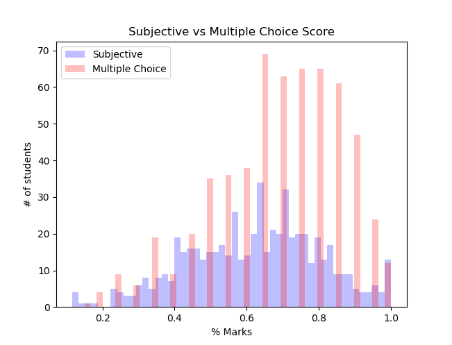
The gaps in the Multiple Choice part is due to discreet possible grades. The hand graded portion looks much more similar to a normal distribution. The overall trend is still same, a slow rise and then quicker falloff.
Correlation between Exams
I also wanted to see if there was correlation between exam scores. Each of the courses had multiple exam and one would normally expect to see quite bit of correlation between the scores. I will use the subjective parts for Course 2 for two reasons. First, it is more continuous(granular), unlike the Multiple choice part which is discreet. Second, the curves are more normal.
For correlation, I could do Pearson/Spearman correlation coefficient for a quantitative estimate, but it would probably not make much sense unless you very familiar with statistics. So, I use a plot which is more intuitive, with darker colors showing more data points/density. The trick is setting alpha, which controls the transparency, to the optimal value. Also, I rounded the subjective score to nearest ten for visualization purposes. With significantly more data points we could probably skip this rounding step.
subjective1 = df['Exam 1 HG [Total Pts: 30 Score] |4531308'].astype(float)/30.0
subjective2 = df['Exam 2 HG [Total Pts: 30 Score] |4681344'].astype(float)/30.0
plt.plot(np.round(subjective1, 1), np.round(subjective2, 1), 'b.',markersize= 10, alpha=0.05)
plt.xlabel('% Marks in Subjective Exam 1')
plt.ylabel('% Marks in Subjective Exam 2')
plt.title('Subjective Exam 1 vs Exam 2')
plt.show()
We get
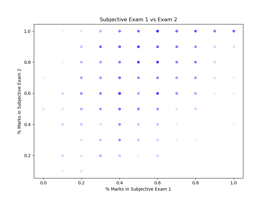
This was a bit disappointing since the correlation is not very strong. But that is probably because the curves for the two subjective parts are significantly different. But on the bright side, the students performed clearly better in the second exam (since I remember both the subjective exams being somewhat equally difficult). None of the courses showed strong correlation between exams.
Modelling Grade Distribution
If we could model the grade distribution, it would tell us a great deal about the exams/labs/recitations themselves. I flipped the distribution about y-axis. That way it looks more similar to the curves we are used to. Before we go about fitting these curves, we need to keep in mind three things
- Different exams were taken by different number of students. So, we need normalize the curves to get any meaningful insight.
- The scale of the x-axis matters for some distribution. So, let’s make the range from 0-100. Remember we have flipped the curve about the y axis
- Number of bins also matter, but that is only because the number of students for each course is not very large. Hence, bins are fixed at 30.
We will ignore the first point for now. My first guess was a Poisson Distribution might be a good fit. So, we define a Poisson Function
def poisson(lambda1, x):
    temp = (np.power(lambda1, x)*np.exp(-lambda1))/scipy.special.factorial(x)
    return temp
This function will return an array of y values when given lambda1, the mean, and an array of x values. Starting from scratch, once again we read the data, but this time we drop the blank/nan values.
df = pd.read_csv('/home/anirban/Projects/gradebook/course1_fall.csv')
#Drop the nan values
df=df.dropna(subset=['Exam1 [Total Pts: 200 Score] |4094707', 'Exam2 [Total Pts: 200 Score] |4274967'])
exam1 = df['Exam1 [Total Pts: 200 Score] |4094707'].astype(float)/2.0
# Flip the curve about y axis and x ranges from 0-100
exam1 = 100+(exam1*-1)
To find best fit we will use Chi-Squared statistics. It’s okay if you don’t know the details but basically it gives a number which tells us how good our fit is. Smaller the number better the fit. Fortunately, scipy provides a pre-built package chisquare.
from scipy.stats import chisquare
n, bins, patches = plt.hist(exam1 ,bins=30, facecolor='blue', alpha=0.5)
plt.xlabel('% Marks')
plt.ylabel('# of students')
plt.title('Exam 1 Score')
bin_diff = (bins[1]-bins[0])/2.0

min_residue = 99999999 #Initialized to an arbitatiry high value
k1_final=1
k2_final=1
for k1 in np.arange(1, 2000, 10):
    for k2 in np.arange(1, 50, 1):
        guess = k1* poisson(k2, bins[1:]-bin_diff)
	#Fit only the peak portion of the curve
        residue= chisquare(guess[0:20], n[0:20])
	#If these set of parameters are better fit
        if(min_residue > residue[0]):
             k1_final = k1
             k2_final = k2
             min_residue = residue[0]

plt.plot(bins[:]-bin_diff, k1_final* poisson(k2_final, bins[:]-bin_diff), label ='Best Fit Poisson')
plt.legend(loc='upper right')
#Best fit k1= 1411 and k2=14.
What we have done here is loop over some reasonable values of parameters k1 and k2 to find the most optimal distribution i.e. the one that gives the lowest value of chi-squared fit.
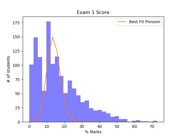
This was clearly a bad fit. The grade distribution curve has much longer tail. The idea of a long-tailed distribution arises in many areas of Physics, but the most prominent ones I would say are Maxwell’s Distribution and Black Body Distribution. So, I decided giving them a shot. This is very similar to what we have done above. There are two changes that we need to make. First, replace guess with the new guess function and second, the range of reasonable parameters for k1 and k2 which is a bit of hit and trial.
guess = k1*((bins1[:]-bin_diff)**2)* np.exp(-k2*((bins1[:]-bin_diff)**2)) 	#For Maxwellian Distribution
guess = k1* ((bins1[:]-bin_diff)**3)*(1/(np.exp(k2*(bins1[:]-bin_diff)) -1 ))   #For Balckbody Distribution
The curves on the right are for best fit Black Body distribution and ones on right are for Maxwellian Distribution.
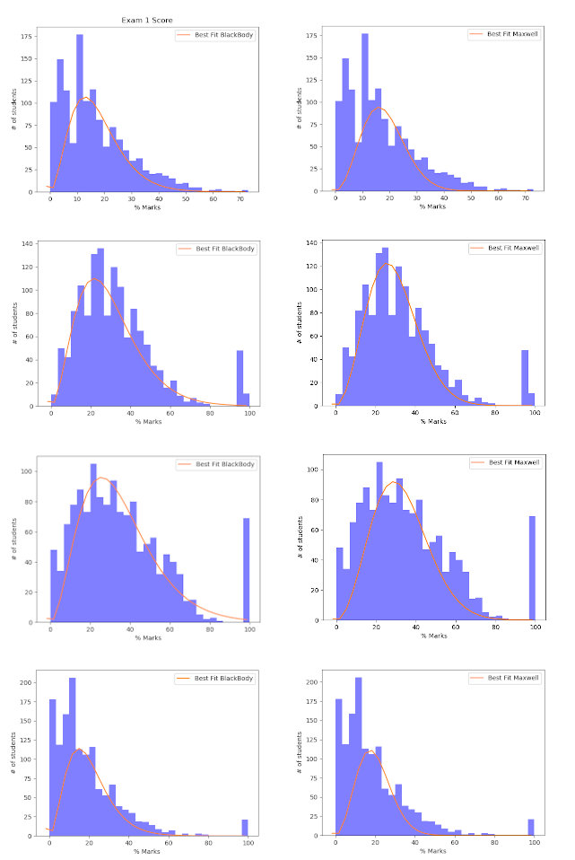
It is clear that the curves do not fit either of the two distribution well in all cases. However, it might still be the case the distributions would fit some other complex parametric distribution. The main issue here seems to be that at x=0, both our test curves go to zero, whereas the actual curve may or may not. We will not pursue this topic further.
Conclusion
So what did we learn ?
-
The most important point is that all grade distributions have a typical shape, but that shape is not easy to generalize. A good follow-up question might be, what does the optimal grade distribution look like? Is there any reason we would expect it to be Normal? With a bit of digging around I found some discussion about this here and here.
-
There seems to be marginal evidence that hand graded exams are more “normalized” than multiple choice ones. But take this with lots of salt because I have only one dataset.
-
The more difficult a course gets, the more “normalized” curves get. Again, take this with a bit of salt for the same reason.
-
Correlation between exams are low which is great news because if you did bad in one exam, there is a good chance you could do significantly better in the next one. So don’t get your hopes down and get ready to Boiler Up and Hammer Down !!
Thanks for reading